
WAITING FOR THE OTHER SHOE......understanding the data of COVID-19

There’s an eerie stillness in waiting. Yup we are all doing our part, staying at home, trying not to look at our finances, wondering what everyone else is doing. I personally have become a champion at online scrabble. At first it felt energizing to play my part and be a hero just by washing my hands and distancing myself from others. We in BC tuned in to Dr. Henry every day at 3 pm like our favourite daytime reality TV show. But the cracks are starting to show in our patience and we need encouragement to stay the course. How long will this go on? Whats really happening out there? Its a bit like the zombie apocolypse with no zombies. I don’t know about everyone else but I have becaome a bit more addicted to my smartphone than usual..surreptitiously checking the CBC more than the Liberals on election day. My husband is an anesthesiologist and works in acute care and the stress is high, not because of all the patients but because of all the talk of what could be coming; they have taken to calling it PRE Traumatic Stress Disorder. I am becoming irritable, sometimes wondering if this is all really necessary?? I can’t imagine how young parents are coping, those who are laid off, the poor, homeless and disenfranchised.
Everywhere we look online there is data being thrown at us....but what does it mean? I dont know about you, but when I am participating in a collaborative team sport - I need to see some kind of scoreboard.; even the online scrabble people know that. So I want to show you BC’s scoreboard and let you know my take on things…So here is where you go for the score if you live in BC.:
http://www.bccdc.ca/health-info/diseases-conditions/covid-19/case-counts-press-statements But don’t stop there! Scroll down and click on the SITUATION REPORT for todays date - then you will come to the current graphs.
And for Canada-wide data: https://www.canada.ca/en/public-health/services/diseases/2019-novel-coronavirus-infection/health-professionals/epidemiological-summary-covid-19-cases.html?topic=About+COVID-19&about=More+details+about+the+cases+reported+in+Canada.
You will notice the graphs are different between the two (generally not as informative on the national site). I want to highlight just a few simple things to remember:
1) Graphs are better than tables-so try to look for a graphic representation- they are generally more clear and understandable with regard to ongoing trends and how we are doing in our efforts to flatten the curve.
2) When BC or any province reports on the new cases each day THESE ARE NOT ALL THE ACTUAL CASES OF COVID 19 in the geographic area. These are simply the cases that are positive in the small group of the population that is being tested. Large numbers of people who have mild symptoms do not meet the criteria for testing and so may certainly have the disease but do not make into this data. However we can still get a lot of information from looking at these numbers.
3) Countries like South Korea have demonstrated that widespread and extensive testing is a huge help in flattening the curve. In South Korea it is helpful to look at the testing based on population size. They have to date done over 6000 tests per million people. If you look at the BC website above you will see that 36,643 tests have been done up until today. That is 7184 tests per million people in BC.
Have a look at the graph on the right fromthe BC website and my thoughts on today’s data.
“How do I know its worth it?”
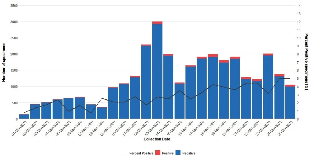
Todays COVID graph from BC: (available on the website mentioned earlier-resolution is bad here)
Looking at the graph and printout we know that this cannot tell us either the prevalence or the incidence of COVID-19 because we would have had to reliably (& that’s impossible) test the whole population of the Province:
Prevalence: The proportion of individuals in a population having a disease or characteristic. Prevalence is a statistical concept referring to the number of cases of a disease that are present in a particular population at a given time, whereas incidence refers to the number of new cases that develop in a given period of time.
However we can still get some good information. You can see from the write up above the graph that the red plus the blue equals the number of total cases tested per day within the population that BC has targeted-: ie hospitalized patients, healthcare workers, long term care facility staff and residents or those who are part of a cluster or outbreak with respiratory symptoms. But the black line is my “go to” when I wonder how we are doing. It is the percentage of the cases tested that were positive.
I find that black line is the best way of knowing if we are making a difference. These stats are from vulnerable and high risk populations so we expect will indeed have some positive tests. Therefore the percentage of positive tests (rate in that population) should mirror how we are doing at flattening the curve in general. And right now -I think that black line suggests we are not doing too badly.
So we should press on. Don’t give up when tempers get frayed and this seems endless. When it comes to scoring and report cards, Canadian citizens are stepping up and getting an A plus! However, I might have to give our federal and provincial governments a slightly lower grade until they get these graphs in front of everybody with clear and transparent words that we can all understand. We should not have to hunt for them.
Anyone for scrabble?
COVID-19 - QUICK, SOMEONE TELL ME SOMETHING SENSIBLE!

Spoiler alert: This blog has very little to do with farming!
OK - Spending 35 years as a medical professional has made me value science and the power of evidence, 4 years of farming has made me practical, but both have forced me to see the value of being the non-anxious presence in the room (or barn or sheep pen or paddock as the case may be). So this morning after I received many texts from family and friends asking me for the “truth” about the Covid-19 virus, I realized that despite a vast amount of daily information in the media and on social media, there was a distinct absence of both the scientific and the practical. There is now so much information out there that is untrustworthy, it is tempting to trust nothing.
I just read a great quote on this subject in my church’s newsletter : “As the world is becoming increasingly aware of the impact of the COVID-19 virus, we believe our best practices will be to respond in self sacrificial love, and to resist the twin temptations of wilful ignorance or reactive fear”.
Wilful ignorance will stand in the way of an incredible opportunity to change the course of this infection, while reactive fear will create chaos, immobilization and helplessness.
First, lets get rid of the rhetoric.
This is not influenza. Covid-19 has a longer incubation (symptom free) period and a higher mortality rate. It is not a cold. Read what the World Health Organization says:
“While the range of symptoms for the two viruses is similar, the fraction with severe disease appears to be different. For COVID-19, data to date suggest that 80% of infections are mild or asymptomatic, 15% are severe infection, requiring oxygen and 5% are critical infections, requiring ventilation. These fractions of severe and critical infection would be higher than what is observed for influenza infection. “
So:
This Covid-19 virus will and should change how we live our lives in the weeks and months ahead. Why? Because every decision you make should be based on the answer to 2 questions:
1) Will this affect my own personal overall health and wellness? and
2) How will this affect the ability of the health system to care for people who need a high level of care?
For most people the answer to (1) is - “not much - most young healthy people have low odds of becoming very ill therefore I will ____________”. (you can fill in the blank - go to that party , fly to Paris etc)
But the answer to 2) is really the key to how we can all change the course of this Pandemic. We as Canadians (based on the current knowlege we have of this illness) could expect from 40-70% of our population to become infected. (40% would be approximately 15 million people). 15% of those will need hospitalization and oxygen (That’s 2.25 million ) 5% would need complex intensive care and ventilation to survive. That is 750,000 people. Number of intensive care beds distributed across Canada (in over 200 hospitals)? Approximately 3500. That’s quite a mismatch.
So if the virus spreads quickly? We will have the situation Italy is facing https://www.youtube.com/watch?v=9mrPHO-nkVE and that is the shown by the orange peaked curve above. 750,000 people needing intensive care quickly over a matter of weeks. This would result in a completely overwhelmed healthcare system in which draconian decisions are made as to who gets the last ventilator. And although this disease mostly affects patients who are elderly or have pre existing illness, the word “mostly” doesn’t mean much when you are dealing with these overall numbers- many younger patients presented with severe illness in italy too.
OK enough of the doom and gloom - here is the good news. We can absolutely change this future but that means we would have to SLOW DOWN the spread of the virus so the system can breathe. That means all the basics; hand washing, no face touching, self isolate when you are sick, avoid handshakes and contact if at all necessary. But there will be additional decisions that, while they won’t affect affect our personal outcomes, could determine life and death for our actual health system. These are decisions like restricting travel ( and not just if you are sick) and making very judicious choices about how important it is to go anywhere where you will be within 6 feet of other individuals, especially group gatherings. (Social distancing). A friend of mine called this “putting speed bumps in front of the Covid -19 virus.” And that will get us onto the more favourable blue curve above. People will get sick at a slower rate, enabling health resources to keep up.
Having said all this, gaining benefit from this level of community prevention is certainly not an “all or nothing” phenomenon. If only some of our population makes some of these preventative choices some of the time, we will still be ahead of the game. This is where the love comes in. It is impossible to know the full social, economic, and emotional impact of these measures for any single individual, so It is as unhelpful to shame someone for deciding to go on their long awaited vacation as it is to shame them for doing a huge grocery shop in case they are called upon to self isolate. The greatest gift we can provide to those who ask us what to do is to provide information without judgement.
In the end, compassionate encouragement may be the greatest antiviral drug we have.
I warned you this was not about farming.